Art Analysis: Nighthawks
Background
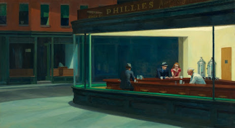
The painting, Nighthawks by Edward Hopper, was created in the United States in the year 1942. It is an oil on canvas painting that Hopper had made taking inspiration from a restaurant on Greenwich Avenue in New York ("Nighthawks").
Art Elements
When looking at this painting I find myself first drawn in by the use of color. A majority of the painting is made with the cool color dark green with a fraction of the painting getting the warm yellow. Doing this gives the viewer a sense of coldness when looking outside of the diner and a wanting feeling to be inside the where the yellow is giving the warmth and light.
The next I find myself noticing when looking at this painting is the use of space working in tandem with the use of color. There are only four figures in the painting and all are within the diner. Meanwhile, the building behind the diner is given less detail and painted darker to show it's distance from the diner. Within that distance between the building and the diner is emptiness within the cooler colored area of the painting. The emptiness with the cooler color work well together to give an eerie feeling to the viewer.
Lastly, I want to paint out the use of lines within this painting. The way lines are done with the structure of the diner helps the viewer more easy navigate their way through the painting. But more importantly, the lines of the window create a frame within the frame of the painting to draw the viewer to the subject of the painting with ease.
To me this feels like an image I would like to have on the wall in my living room. The three elements I had given above make me feel like the painting gives the viewer a feeling of an being an outsider unable to fit in. There are times when I feel that way and this painting makes me feel a little sad as it gives me that feeling, but it is something I have accepted.
“Nighthawks.” The Art Institute of Chicago, Arts of the Americas, 1 Jan. 1970, www.artic.edu/artworks/111628/nighthawks.

Hi Brycen! I like your choice of painting for this week's assignment. Edward Hopper's artwork is a classic American painting of this era. It feels like a scene from Twilight Zone but in color. I enjoy the contrast of the cool dark green and warm yellows to draw attention to the warmth of dining in. Giving the view of some warmth to the loneliness being experienced. The clean lines help frame the messages portrayed by the subjects inside the diner. This allows the focus on the expressions on the faces and their body language. The cleanliness of the streets gives it that eerie twilight zone, collective consciousness. Seeing others experience sadness gives ease to the feeling of loneliness. Embracing solidarity with different dimensions of shadowing shows us the separateness and oneness as well. We all have a sadness/shadow side, but we are not alone in this great big lonely world. Great pick! I think we learned a lot from the pandemic, and how important connection is for our mental wellness.
ReplyDelete